The background of the image is a feature I like as it is slightly blurred and the model protrudes from the page. Although, I dislike the model's pose and how her eyes are slightly squinted.

In this image the models head has been cut off. which isn't good photography. The image is also blurry and the mise-en-scene of this picture isn't what you would expect to see in a magazine feauring a big celebrity.

The model is not posing particularly well. The lighting is very low and dull. Therefore, it is unusable.

This image is an extreme close-up and I couldn't find anywhere it could fit into my magazine. s I found extreme close-ups tend to not be used in music magazines and are not a common feature.

This image is completely unusable as the model is in an awkward position, unready for the image and is looking down.

The models is over-smiling on this image and is again looking away from the camera. I also find that her outfit is a bit too plain.

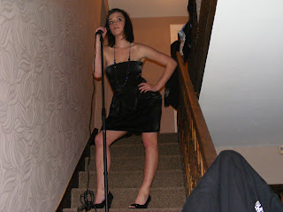
I disliked all of the images of the model on the stairs, I found the area looked too cluttered and unprofessional. The lighting was very low so the pictures are unclear and quite dark.

I took a few images of this model, too and found this one was particularly dark and a lot of them were not particularly what I was looking for.

Although, in this image I like the style of the model as she looks edgy and more 'celebrity-like' which suits my article perfectly. This image is unusable as the flower she is holding is blurred and so his her arm. She is also looking unready for this image as she is looking away and not showing any sign of posing whatsoever.

The model appears very young in this image which would not relate to my storyline at all. I dislike the position of her arm and the fact she is looking away from the camera, again.

The model is again in an awkward pose as she is slouching forward and the image is slightly dark.

This image is extremely dark (low-lit) and even if it wasn't so dark the model isnt looking towards the camera, she is looking away, so it would defenitely not be an image I could have used on the cover of my magazine.

This image has a very unprofessional background and the model is in an awkward pose, with one arm behind her back. It is not something you would find in a real magazine and I found it to be useless.
 The background of the image is a feature I like as it is slightly blurred and the model protrudes from the page. Although, I dislike the model's pose and how her eyes are slightly squinted.
 In this image the models head has been cut off. which isn't good photography. The image is also blurry and the mise-en-scene of this picture isn't what you would expect to see in a magazine feauring a big celebrity.
 The model is not posing particularly well. The lighting is very low and dull. Therefore, it is unusable.
  This image is an extreme close-up and I couldn't find anywhere it could fit into my magazine. s I found extreme close-ups tend to not be used in music magazines and are not a common feature.
  This image is completely unusable as the model is in an awkward position, unready for the image and is looking down.
 The models is over-smiling on this image and is again looking away from the camera. I also find that her outfit is a bit too plain.
  I disliked all of the images of the model on the stairs, I found the area looked too cluttered and unprofessional. The lighting was very low so the pictures are unclear and quite dark.
 I took a few images of this model, too and found this one was particularly dark and a lot of them were not particularly what I was looking for.
  Although, in this image I like the style of the model as she looks edgy and more 'celebrity-like' which suits my article perfectly. This image is unusable as the flower she is holding is blurred and so his her arm. She is also looking unready for this image as she is looking away and not showing any sign of posing whatsoever.
  The model appears very young in this image which would not relate to my storyline at all. I dislike the position of her arm and the fact she is looking away from the camera, again.


No comments:
Post a Comment