I looked at various other music magazines such as 'Blender' and 'Vibe' which are already on the market and realised that the genre I was going to focus on was pop and R&B, as these types of genres are the ones I enjoy most, therefore I concentrated on this specifically. I noticed that most music magazines only feature one main artist, usually in medium close up shot to medium long, this is a
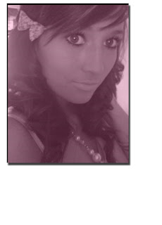
 convention I took into consideration when designing my magazine front cover. A specific colour scheme is often used throughout the cover too and I developed this feature into my magazine. The majority of magazines I looked at such as 'Vixen' and 'Blender' have very simple layouts, with the a long, body shot of the main model centred and the writing around her shape. Although, my model is the main in the magazine, I decided to, go for a medium close shot of my model. Other conventions of music magazines is that they often include magazine hooks for stories, which is what I have included on the front of my magazine. Music magazines have a barcode, a price date, a masthead and justified text, also with a limited number of colours, fonts and a website address. I decided upon this as I didn't want my model to come across overtly sexy or promiscious, but laid back and down-to-earth, so that my audience (teenage girls) could relate to her. This also comes across in the way she dresses, because she isn't dresses particularly revealing or sexy, but rather more casual clothes. Another convention I have followed is my model is attractive, this is a feature I noticed most music magazines follow and when researching this came across the theory of Naomi Wolf. Naomi Wolf (1991) believes that images of attractive model's not only intrigue men, but also women, which are used to sell magazines to women because they've been conditioned into aspiring into that lifestyle and appearance.
My contents page's follow magazine conventions, as its layout is quite simple, it has structure and when studying other magazines I noticed the colour scheme from the front of the magazine is often carried through to the contents page and decided to use this when constructing my magazine. Also, most music magazine contents pages are two pages such as 'Q' and 'Word' so again I used this idea in my magazine. Some music magazines have editor's letter and I decided that this would help aim the magazine to teenage girls perfectly s the editor could establish a relationship with the reader throughout the letter. This allows them to feel a sense of belonging to the magazine, so they'll be encouraged to buy it. The fact I used a script font to sign it adds to this feeling as it is planned. I did this by using relaxed lexis/phrases such as 'girlies' and mentioning things teenage girs enjoy such as the beach, summer and tanned legs.
My magazine article also tends to follow the pop music magazine conventions, espescially with the fact that it is about a 'celebrity' and includes an interview and questions which the girls will enjoy reading. I noticed when analysing pop magazines that they tend to focus on the gossip aspects, so again I followed this convention.
How does your media product represent particular social groups?
My magazine represents stereotypically girly teenage girls (ranged between the age of 15-25 year olds) who are interested in upbeat music such as pop and R&B.
My model could be protrayed negatively as in my story she used to be on drugs, but I decided to appeal to the more positive side of the story by having her over drugs and doing well in her music career. I did this to appeal to the teenage girl's sensitive emotions and not by following conventions of normal gossip magazines, where they like to often protray stars as negatively. Although my model is quite young she is meant to be roughly twenty-five, although this is not representing teenage girls themselves, they do often aspire to be like successful people, who are older than they are. This is why my model is this age, as she can help the teenage girls through problems they might be having on their own and it gives the girls a role model.
With her being from a working class background and her having achieved her status in society, she is an inspiration to my audience. Her lexis is still quite working class, meaning the audience can relate to her, therefore they are more likely to buy the magazine.
I break the conventions of my model being dependant on men, as she is now an independant woman, who makes her own money and is not superficiall.
There is a positive representation of teenagers in the media and I've produced a positive article about one who has overcome her problems and can be looked up to as an inspiration.
What fund of media institution might distribute your media product and why
 ?
?If my magazine were to be published, it would be by 'Bauer' a British media company which bought 'EMAP plc' for £1.14 billion, they specify in magazine productions such as 'Q' magazine. I understand that 'Q' magazine is aimed at a different audience than mine, with a different genre, but 'Bauer' would wish to expand their share of the market by focusing on a new style and genre; such as my magazine. This way the company can go for a new audience and increase their earnings.
Who would be the audience for the media product?
As stated above, my music magazine is aimed at teenage girls, this would be the age of 15-25. I researched audiences of music magazines and found that boys tend to stay more interested in music magazines, espescially rock and indie genres, whereas girls tend t
 o lose interest in this and move to gossip magazines such as 'OK!' This is also why my magazine is a pop-orientated, as this genre of music magazine tends to aim at teenage girls.
Girls move on to lifestyle magazines which is why I have based some elements of my magazine on 'Cosmo Girl!' There aren't many magazines aimed at women in their late teens-early 20's, so this would allow the market to be expanded.
With my audience being rather young, money they make would either be from parents or they may have a part-time job, or have left school and have a full-time job, either way, I understand that the younger audience's tend to not have a lot of money coming in. This means my magazine has to be priced reasonably, that is why my magazine is £2.50 and is a monthly issue. If the magazine was a weekly issue the price would have to be lower, but could not go lower than £1 as the magazine is intending on making a profit. Therefore my target audience would be paying more than £4 a month for the magazine, which is slightly unreasonable considering their low income. This is why the price of my magazine is quite reasonable, but would still give a healthy profit; as over-priced items tend to fail in the marketing industry. This compares with a similar price of teenage magazines such as 'Cosmo Girl!' and 'Glamour' magazines.
With the magazine being aimed at a younger audience they tend to be living off their parents income or working on not particularly well-paid jobs - but could afford £2.50 a month and could buy cd's and go to the odd concert.
How did you attract/address your audience?
To attract my audience I have used sterotypically feminine colours such as pink and baby blue, this ensures when my magazine is on the shelf in a shop they are lured in and can recognise immediately this is a magazine aiming at teenage girls.
Colloquiall language has been used throughout my magazine such as 'fittest lads,' 'cash' and 'pics.' This was done intentionally as I wanted my audience to be able to relate to the magazine and be encouraged to think of it as their own, so they will buy future copiesand colloquiall language is often the type of language used by teenage girls so they can relate to the magazine.
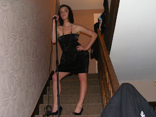
On my front cover the image of my main model is a medium shot, this was used as I wanted the girls to be able to see the happy expression upon the model's face, giving my magazine an upbeat feel to it, relating to my genre. Marjorie Ferguson, (1980) who identified four types of facial expressions for the cover of British women's magazines and when looking at her research the image on my front cover is a 'super-smiler' as the model has a wide,open toothy smile, her full face is shown and her hair is slightly wind-blown. This again implies my model is rather relaxed and down-to-earth as she isn't posing or trying to be sexy. Whereas, in my magazine article, the main image used is a low angle long shot, showing the model's full body and some mise-en-scene (the background.) I used a low angle shot to make the model look powerful and strong, after all the story is based upon her comeback. This particular photograph is well-lit by natural lighting, giving an uplifting feel to the image.
I'm taking advantages of Blumler and Katz's Uses and Gratifications Theory to sell more copies. My audience will experience some gratification from my magazine as they will discuss the article and gossip with their friends. I have used people around the same as me, which means i am familiar with what they are interested in and it helps my audience relate to my magazine, subtly pushing them to buy it. Also, one feature of my magazine is 'Top 20 Fittest Lads Inside,' which would give the teenage girls a kind of gratification, this is why I included this feature in my magazine.
A lot of other features in my magazine such as 'Greatest Tearjerkers' 'Aww!! Baby Pictures' and 'Hot Outfits' appeal greatly to my audience as they play upon the things which girls are sterotypically perceived as enjoying. This again shows uses and gratifications, because I based these features on my research amongst my audience.
I conducted a survery which I handed out to 20 teenage girls and their responses were mainly similar. This helped me conduct certain aspects of my music magazine. Such as the colour scheme, pink and blue was used as it was the most popular response. This means my audience were slightly involved in helping conducting some choices in my magazine, giving them some power.
I showed my finished production to ten people from my target audience and shall now give an example of what they said.
Charlotte Botcherby said: 'It has a very professional touch and I would defenitely buy it, if it was on sale. I like the colour scheme and how the magazine is not over-complicated.'
Laurel Malcolm said: 'I think this magazine is excellent and is different from other music magazines which I have seen. I would love to read a magazine like this as it combines celebrity real life and music in one. Instead, of just focusing on gossip. I think it looks very professional and would like a magazine like this to be released.'
Audience feedback is important as it allows the magazine to maintain standards and continue to do well in the marketplace. Because of the fact that I did audience research firstly, (my questionnaire) it allowed me to target my audience specifically.
What have you learned about technologies from the process of constructing this product?
I have developed skills of image manipulation and page layout on Photoshop a
 nd can give an example of this as the editor's letter image took a lot of time to transform. Firstly, I took the image in a well-lit room as I wanted the image to be light as this represents the editor well and gives her connotations of being nice and angelic. This reflects the way I dressed the model as I placed a small ribbon in her hair to make her look nice, friendly and innocent. Also, with her being young and having such a good job she is an inspiration to my audience and they can relate to her.
The rest of the images were captured in natural lighting and the images outside at the beach and infront of the tree worked particularly well. I used a digital camera and a tripod to capture these images.
Just by using www.blogspot.com I have shown I can grasp the ideas of new technology well and use this website to display all of my work.
I have used another useful website (www.surveymonkey.com) to display my questionnaire as I could not post it onto my blog.
Looking back at your preliminary task, what do you feel you have learnt in the progression from it to the full product?

Looking back at my preliminary work I notice that my real piece is a massive improvement. This is not only because I had longer to conduct this piece, but also the fact that have researched music magazines and I've researched the requirements of my target audience and understand a lot on what they should be like and I have also analysed these types of magazine to see how they appeal to their target audiences and adapted knowledge to help with the making of my magazine.
I have had a lot more experience with photoshop since creating my preliminary magazine and now have a better understanding of how to manipulate images, how to make text stand out from the page and adapting my langu
 age choice to suit my audience.
I believe my music magazine would be successful in an existing marketplace on the shelves of newagents and department stores and there would be realistic competition between my magazine and other existing music magazines already released.
I took my time with the photography;taking more photographs to enable more choice because the use of a good photograph is important in setting the tone of the page.


 This is the second page of the article and is a large image of Joan Wasser, which is who the article is based on. I like this convention and shall use it when creating my article.
 ns of what they normally are like in music magazines and to help me with ideas for conducting my piece.